Reviews
Southern Vermont Arts Center Exhibition - Wilson Museum 2025
Artscope
September 4, 2024 Edition


Art New England Review
Paul Gruhler—Harmonics: 60 years of Life in Art, The Chelsea Series 1963–1978,
Highland Center for the Arts • Greensboro, VT • highlandartsvt.org • July 16–August 29, 2021
by Cynthia Close May/June 2022
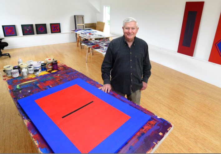
Color vibration appears to levitate the hard-edge geometry in the paintings and collages of Vermont artist Paul Gruhler. For over 60 years, Gruhler has been exploring endless compositional variations achievable within a powerfully focused set of three simple shapes, the square, the rectangle, and the line, all of varying sizes, sometimes tilted on their axis, held in a sort of suspended animation by color juxtapositions that sing when they abut. Blues, reds, and purples predominate. The tonal range is middle to dark. These paintings do not shout for attention. They hum.
At 7:00 a.m. every morning, Gruhler is in his Craftsbury studio quietly looking out at the ever-changing light on nearby Belvedere Mountain. He is meditating, preparing to start the day’s work which might include painting with acrylics on linen or assembling geometric cut paper forms into abstract collages. His methodology is intuitive rather than formulaic. Still active at the age of 80, this prolific artist has been tenacious in his dogged pursuit of the transcendent experience in art. Elements of his approach are reflected in color saturated works by Mark Rothko, or the analytic limited color geometry of the German abstractionist Josef Albers, yet Gruhler has developed a visual language all his own.
Paul Gruhler, Chelsea Series #21, 1975, acrylic on canvas, 30 x 44″.
It is remarkable, given the consistency and mesmerizing quality of Gruhler’s richly colored jewel-like surfaces, that he is not better known outside a close-knit group of friends and admirers. Paul Gruhler—Harmonics: 60 years of Life in Art, The Chelsea Series 1963–1978 opening at the Highland Center for the Arts in July presents an opportunity to become familiar with his early work. Three additional satellite exhibitions, opening in September at The Vermont Supreme Court Gallery, The Vermont Arts Council: Spotlight Gallery, and The Gallery at Central Vermont Medical Center, cover different phases of Gruhler’s oeuvre. Extending until the end of 2021, they provide a comprehensive view of Gruhler’s career. A limited-edition book of the same title, Harmonics: 60 Years of Life in Art, accompanies the exhibition. Beautifully designed by Linda Mirabile, it includes a perceptive essay by Carolyn Bauer and provides a roadmap to perceiving this impressive body-of-work.
—Cynthia Close
Times Argus Review
Conversations in Art: Paul Gruhler: 60 years of life in art
by B Amore May 2022
The boldness of the color juxtapositions in Paul Gruhler’s painting makes an immediate physical and emotional impression. The viewer is forced to stop and look! There is no “just walking by.” Like the Chinese brush painting that Gruhler saw as a child, there is a deep sense of presence, as if the strokes of color had just been laid on before our eyes. The “moment” is the essence. The geometry of the design seems almost secondary to the juxtaposition of the color tones, which have an immediate connectivity.
On a recent visit to Paul Gruhler’s studio in Craftsbury, I stood spellbound before his painting, “Chelsea Series #4,” composed of two large blue rectangles separated by a narrow red-orange line. I felt the resonance of the painting’s energy in my whole being; my heart and body were filled with a deep feeling of over-powering stillness. This entirely unexpected visceral response stayed with me as I visited the other paintings that Gruhler had set up along the walls. Each one was meticulously rendered in rich tones of blue, red, orange, purple. The use of the contrasting complementary colors gave each work a unique, specific energy.
The paintings have a magical quality, as if the colors are living, pulsing entities that beat in concert with the human heart, arousing an emotion within the viewer that echoes Mark Rothko’s words, “A painting is not a picture of an experience. It is an experience.” Gruhler understands this and offers us a multitude of experiences if we are willing to pause and take them in. They offer a rare existential encounter with the magic of pure color.
Gruhler is an artist who has educated himself through a passionate painting practice that has spanned 60 years. New York City itself was the school that he attended. In 1962, he set up his own art studio on 28th Street, a hotbed of artists in downtown Manhattan, and proceeded to have his first one-person show at the DeMena Gallery on East 88th Street in 1965. He was mentored and informally taught by three well-known artists: Michael Lekakis, a sculptor, and painters Harold Weston and Herb Aach, as he explored his chosen path of Geometric Abstraction.
The aspiring artist was part of this new movement, the antithesis of Abstract Expressionism that espoused gestural brushstrokes and often wildly interpretive painting. By contrast, Geometric Abstraction uses strictly regulated forms with non-objective compositions. Gruhler’s dedication to finding harmonic balance between color and form has continued to be a lifelong passion. Travels in Mexico, South America, the Far East and Europe enlarged the scope of his work which has been shown internationally.
In addition to his dedicated art practice, Gruhler has curated several important exhibits, most notably “Vermont Collections,” culled from 16 public collections, to celebrate the Helen Day Art Center’s 20th Anniversary in 2006. From 2008 through 2011, he curated “The Art of Vermont: The State Collection,” a series of exhibitions that traveled to 10 museums and art centers across Vermont. These installations were funded by the Vermont Arts Council through an National Endowment for the Arts grant, and the state of Vermont.
Gruhler’s exhibit, “Harmonics: 60 Years of Life in Art,” opening today (July 17) at the Highland Center for the Arts in Greensboro gathers a lifetime of paintings, drawings, sculpture and paper collages. A sumptuous catalogue with an essay by Carolyn Bauer, associate curator at the Shelburne Museum, accompanies the exhibit and traces the trajectory of his development from the formative New York years through his subsequent move to Vermont in 1993, and into the present. Companion exhibits at the Vermont Supreme Court Gallery and the Spotlight Gallery at the Vermont Arts Council in Montpelier, and the Gallery at Central Vermont Medical Center in Berlin explore various periods of Gruhler’s life’s work.
This series of exhibits is a momentous exposition of the work of a master of color and form. Vermont is privileged to have Gruhler as one of its most talented and dedicated artists, and one who is committed not only to his own art practice but to supporting others as well. Here are some excerpts, in Gruhler’s own words, from a recent lively conversation.
B.A.: You refer to early experiences with ancient Chinese brush painting and porcelains. Could you share the impression they made on you as a child? Was art part of your family life? Did you study art in grammar and high school?
P.G.: My first exposure to Chinese art was at the China Institute in the 1950s in Manhattan where my family attended a fundamentalist Christian assembly. They always had an art exhibition in the room where we met. As the preaching of the elders melted into rhythm and cadence, I plunged into the intense colors and abstract forms of the ancient ink paintings and porcelains surrounding me. I became aware of the universal in art. The color and form of the ceramic objects resonated with me. The beautiful, pure color of the vases, which I later learned came from the Sung dynasty, were particularly striking.
In the third grade my teacher told me to draw trees outside. She was very upset with me when my trees were abstract forms in bright colors, the colors I use today, red, purple, and blue, in my work. This drawing was put in a book and rediscovered by my sister Carol many years later.
B.A.: Can you speak to your journey as a self-taught artist? Were there artists in your family? Was your family supportive? High school art classes? How did you meet Lekakis who became your mentor?
P.G.: No, there is no history of artists in my family, and they were not supportive of me being an artist. I did not have any art classes in high school. In the early ‘60s, I was introduced to Lekakis through a Chinese artist who had given me some paints and brushes. That is how I started painting. Initially, I was more interested in poetry but realized early on that I had no way with words.
I attended lectures at Cooper Union with Michael Lekakis, a sculptor/poet, who became a mentor and friend. He was instrumental in encouraging me to attend art events and invited me to museum openings where he introduced me to many of the contemporary artists.
Lekakis introduced me to Harold Weston at an exhibition at the Whitney Museum when it was on 54th St. He also introduced me to Alexander Calder, Ilya Bolotowsky, Barnett Newman at their openings at the Guggenheim Museum.
Michael was very philosophical and encouraged me to read the Greek philosophers. I never went to art school. I had a loft on West 28th Street in the wholesale flower district from 1962 to 1979.
The 28th Street art community was tightly knit. We were all living in lofts that were illegal. In addition to Lekakis having a studio there, Zero Mostel and Herb Kahlem were in the building across the street from mine. We all rented raw space so we had to do our own renovation. The wholesale flower market had most of the ground floor space of these buildings. The flowers started to be delivered around midnight by trailer truck. There was a lot of activity by night and day.
B.A.: What was the role of mentors in expanding your understanding and knowledge? Why Geometric Abstraction? Did you experiment with other modes of painting — i.e. styles? Oil vs. acrylic?
P.G.: My first series of paintings were small brush strokes across the canvas which were influenced by the Abstract Expressionists. By the mid ‘60s my work evolved into a more meditative place. The influence of living in New York City with its grid system of streets and the architecture that was being built at that time made me want to have a more defined relationship between the color and form.
When I was doing the small brush stroke paintings, I worked in oil, but to get the surface and reflective light I was looking for I started using acrylic paint. It was an easy transition from oil to acrylic with the biggest advantage being the quick drying of acrylic.
B.A.: What is the interface between the urban architecture that you lived in for much of your life, and the geography of your now-home state of Vermont? What brought you to leave New York City and move to Craftsbury in 1993?
P.G.: When I left NYC in 1979, it was job-related, and I moved to Oklahoma then New Hampshire before coming to Vermont in 1993. I had started working for American Airlines as a clerk at LaGuardia Airport and then took various positions in marketing. This was a conscious choice. Working for AA enabled me to travel extensively to museums and art centers in the United States and Europe.
I was able to take samples of my work which resulted in my exhibitions in Finland and other countries in Europe. I consider my travels to be a major part of my education because I went all over the world and experienced the history and art of many cultures.
I worked every day at my art whether I was traveling or in my studio. I carried a sketch book with me wherever I went. I had gone to a reading by Robert Frost in the early ‘60s. When I later learned that he was buried at the Bennington cemetery, I came up to pay homage. It was my first time in Vermont, and I also discovered Bennington College. I had several friends who had moved to Vermont, and eventually felt that it was the right place for me.
B.A.: Could you describe your working process? You say that “nothing is pre-planned,” which seems to be at odds with the strict geometric shapes that are the backbone of your work.
P.G.: I go to the studio every morning around 7, make myself an espresso, read poetry and look out at the landscape, which is a view of the Green Mountains. I have several Vermont poet-friends, among them Gregory Djanikian and Judith Chalmer.
Then, most days I do marker drawings in my sketch book. After that I start working on collages or paintings. When I am working on a painting, the form and color develop as I am working on it. I mix one color at a time to achieve the relationships between the color and form.
Originally, Herb Aach taught me how to grind pigments and make paint. Now, I use Golden Acrylic Paint and keep mixing it until I get the right color. Once the batch of color is used, I can’t reproduce it.
I work on one section of the painting at a time. I tape and seal it with gel and remove it when each form is complete, so I really don’t know what the relationships of the color and the forms will be until all the tape is removed.
B.A.: The newer works seem to have more diamond shapes — what has prompted this change?
P.G.: In 2010 I started painting sheets of paper and cutting them up to make collages but I was not able to get the flat surface I was looking for with the different adhesives and glues I was using. My friend Claire Van Vliet suggested I come to her studio to work on the collages and taught me how to dry mount them which enabled me to achieve the surface I was looking for. These collages were done with vertical and horizontal forms.
In 2018 I traveled to Sicily where I visited several Greek and Roman archaeological sites. I was captivated by mosaic floors that had diamond shapes in them. This resonated with me so when I came back to the studio I started making collages with diamond shapes in them and subsequently used them in my paintings. I keep exploring new directions.
B.A.: I see that you have curated some very important shows for the state of Vermont. It’s unusual that a working artist would take the time to do this. Could you speak to what prompted this interest?
P.G.: In 2006, Mickey Myers, who was (then) the executive director of the Helen Day Art Center, asked me to curate “Vermont Collections’’ to celebrate their 20th anniversary. I told her I wasn’t a curator, but she insisted that with my art background and knowledge, I could do the job. As I visited the 16 art institutions and universities to make my selections, I realized that the years I spent in New York looking at art served me well.
I chose one painting from the state of Vermont Art Collection, “Champlain Valley” by Thelma Appel. Many people were surprised that contemporary painting was in their collection. I proposed to David Schütz, Vermont state curator, that the people of Vermont’s art collection should travel across the state.
Subsequently, Judith Chalmer, (then) executive director of VSA Vermont, now Inclusive Arts Vermont, asked me to curate “Engage,” a traveling group juried exhibition that featured work of Vermont artists with disabilities. Part of my motivation for curating was to help Vermont artists get their work shown to a larger community.
I found curating very gratifying because I was able to include many artists from Vermont, and helped get their work into some collections which was very satisfying.
B.A.: What does it feel like to be mounting “Harmonics: 60 Years of Life in Art” at the Highland Center for the Arts, as well as subsequent shows at the Vermont Supreme Court Gallery, the Central Vermont Medical Center, and the Vermont Arts Council, as well as publishing a retrospective book on your work?
P.G.: My heart is filled with gratitude for all the people that have been supportive of me over my life and with the production of this book, especially Linda Mirabile, RavenMark Design and Carolyn Bauer. It has been an amazing journey to put the experiences in my life in an amazing book and that reinforces my accomplishment as an artist.
A catalogue, “Paul Gruhler, Harmonics: 60 Years of Life in Art” is available during the exhibit at the Highland Center for the Arts: The hard cover with dust jacket is a limited edition of 100 books and includes a limited edition, signed print ($100, or soft cover with fold-in flaps ($35).
Seven Days–Art Review: Paul Gruhler,
Highland Center for the Arts, Greensboro by Amy Lilly August 2021
This story has been updated to reflect the cancellation of several upcoming exhibits due to COVD-19 restrictions.
Paul Gruhler, a Craftsbury painter who will turn 80 in September, meant only to make a catalog of his work. A year ago, he floated the idea to his friend Linda Mirabile, principal graphic designer of RavenMark in Berlin, Vt.
When she visited Gruhler's studio, Mirabile saw 60 years' worth of work, neatly dated and stored by series — from the earliest Chelsea Series of the 1960s and '70s to the Points of Reference Series of 2019 and 2020. She suggested the work deserved more than a catalog.
With the help of many, Gruhler's life's work is now the subject of four coordinated exhibitions around the state, each representing a different period in his career. At the Highland Center for the Arts in Greensboro, visitors can see "Harmonics: 60 Years of Life in Art," comprising selections from the Chelsea Series, through August 29.
Gruhler has pursued a single style for six decades: hard-edged geometric abstraction.
And there is a catalog, designed by Mirabile and beautifully printed by Villanti Printers in Milton, with a foreword by Vermont state curator David Schutz and an art historical essay by Shelburne Museum associate curator Carolyn Bauer.
A flip through the catalog makes one thing clear: Gruhler may have explored variations in materials and an extraordinary range of color over the years, but he has pursued a single style for six decades: hard-edged geometric abstraction.
The movement, begun in the late 1950s and exemplified by Kenneth Noland, Ellsworth Kelly and Josef Albers, was a reaction against the personalized gestures of abstract expressionism. It blossomed just as Gruhler, who grew up in Queens, N.Y., graduated from high school in 1959 and hit the streets of Manhattan for what would be his only art education: total immersion in the art scene as it happened.
The Highland exhibition, curated by Maureen O'Connor Burgess, shows the progression of Gruhler's style after he secured his first studio in the city's gritty Chelsea district, in 1962, at the age of 21. An early work in oil from 1963, "Chelsea Series #12," is a gestural, amorphous zone of variegated blues featuring an energetic burst of indistinct white brushstrokes at the center.
Created two years later, "Chelsea Series #18" bridges the gap between abstract expressionism and geometric abstraction. The 60-by-48-inch oil painting is filled with short, straight brushstrokes in reds and pinks layered on a red-oxide background.
"That was my first real voice: gestural but [focused on] color and straight lines," Gruhler said, his Queens accent undiminished, during a gallery visit with Seven Days.
By the time he made "Chelsea Series #45," in 1967, Gruhler had landed on the style of most of the work displayed at the Highland — and which continues to fascinate him today. The 50-by-90-inch acrylic painting divides the canvas into two geometric blocks of slightly different blues joined by a thin horizontal band of reds arrayed in irregular stripes. All the edges are done with tape. Later, the artist perfected his color application, eliminating the faint evidence of brushstrokes, and began to seal the tape with gel to attain sharper lines.
For Gruhler, the fascination of these compositions lies in the balance of tension created by the forms and colors. He mixes his own colors, using each one only once, and donates the extra paint to the Howard Center in Burlington. Only recently has Gruhler realized that he needs to document his color recipes: "I had to touch something up, and I had no idea what was in it," he said.
Gruhler credits three mentors with helping him find his voice. In 1960, he befriended Michael Lekakis, a sculptor and poet who'd had solo exhibitions at the Guggenheim Museum and Whitney Museum of American Art. Lekakis brought the budding artist to openings and artists' gatherings, where Gruhler mixed with the likes of Alexander Calder, Isamu Noguchi, Louise Nevelson and Barnett Newman. Lekakis wrote captions in poetic form for Gruhler's first solo exhibition of paintings, at the De Mena Gallery in 1966.
"It was such a vibrant time then, after World War II," said curator Burgess, who attended Manhattanville College for art and art history from 1970 to 1974 and is also curating the medical center show. "Artists were settling into this community, and a lot of it was basically illegal; they were squatting. I remember walking up three flights in the Meatpacking District, and there would be all this incredible art. It was really laid-back, not formal at all. That was when Gruhler was just finding his style."
In 1964, Lekakis introduced Gruhler to modernist painter Harold Weston, a pivotal figure who helped organize the National Council on the Arts and Government (the first federal funding of the arts) and served as art adviser to the United States Information Agency. Weston became Gruhler's first patron and facilitated his first solo show abroad, in Mexico City in 1967.
The rest of Gruhler's overseas exhibitions were due to his own efforts. In 1961, he had taken a marketing job with American Airlines to educate himself about Greek and Italian art. "I could fly almost for free — all one-stops to Europe to see an exhibition — and I got a deep discount for hotels," Gruhler recalled. Toting his portfolio and slides of his work on these trips, the artist landed solo and group exhibitions in Finland, Sweden, Germany and the Netherlands.
Lekakis wrote poetry to accompany the Mexico City exhibit, an excerpt of which is on display at the Highland Center. Poetry deeply interested both artists. Gruhler, who was raised in a Christian fundamentalist family, heard his first poetry unrelated to the Bible when a high school teacher read aloud Robert Frost and e.e. cummings. Moved, he attempted to become a poet, he remembered, but realized "I had no way with words." Gruhler had dyslexia, a diagnosis not made until he was in his sixties. He still reads poetry daily in his studio to reach a meditative state before painting.
That multidisciplinary approach, Bauer noted in a phone call, was common in the '50s and '60s. Many artists, including Joan Mitchell and Frank O'Hara, tied their practice to poetry, meditation and philosophy. "It was in the water," said Bauer, who curated an exhibition of geometric abstraction called "Hard-Edge Cool" at Shelburne Museum in 2016.
In 1965, Gruhler met his third mentor, German American artist Herb Aach, whom he described as "an expert in color." Aach introduced him to acrylics, a revelation for the artist, he recalled, "because I couldn't get that flat surface with oils." Aach, the chair of the art department at Queens College, also suggested applying a clear coat of acrylic polymer on a stretched Belgian linen canvas to seal it against color bleeds. The sealant allowed Gruhler to isolate blocks of flat, saturated color against a beige background.
"Chelsea Series #4," from 1978, is a particularly stunning example of Gruhler's use of exposed, treated canvas. The painting comprises two dominant blue blocks of different shades, bookended by vertical bands of darker blue and separated by more vertical bands in lighter blue and a central red; the tactile beige linen frames them all and divides each band and block.
"[The beige canvas] floated for me, and it made a tension with the forms. I used subtle shifts in color to create this tension," Gruhler said.
How did he end up in Vermont? Gruhler came to the Bennington area to pay homage to Frost on the poet's death in 1963, but it wasn't until 1993 that he decided to move to the Green Mountains. His New York neighbors, writer Kathryn Davis and filmmaker Walter Ungerer, had made the move to teach at Goddard College, and Gruhler's visits to their new home confirmed to him that the place facilitated meditation and painting. He has not stopped doing both since.
"He has stuck with geometric abstraction. He has this endless fascination with color and form," Bauer said. "It's incredible how many variants one can do with just these elements. And he has perfected it over time."
Times Argus Review - Conversations in Art- Paul Gruhler: 60 Years of Life in Art by B Amore Arts. Correspondent July 17, 2021
The boldness of the color juxtapositions in Paul Gruhler’s painting makes an immediate physical and emotional impression. The viewer is forced to stop and look! There is no “just walking by.” Like the Chinese brush painting that Gruhler saw as a child, there is a deep sense of presence, as if the strokes of color had just been laid on before our eyes. The “moment” is the essence. The geometry of the design seems almost secondary to the juxtaposition of the color tones, which have an immediate connectivity.
On a recent visit to Paul Gruhler’s studio in Craftsbury, I stood spellbound before his painting, “Chelsea Series #4,” composed of two large blue rectangles separated by a narrow red-orange line. I felt the resonance of the painting’s energy in my whole being; my heart and body were filled with a deep feeling of over-powering stillness. This entirely unexpected visceral response stayed with me as I visited the other paintings that Gruhler had set up along the walls. Each one was meticulously rendered in rich tones of blue, red, orange, purple. The use of the contrasting complementary colors gave each work a unique, specific energy.
The paintings have a magical quality, as if the colors are living, pulsing entities that beat in concert with the human heart, arousing an emotion within the viewer that echoes Mark Rothko’s words, “A painting is not a picture of an experience. It is an experience.” Gruhler understands this and offers us a multitude of experiences if we are willing to pause and take them in. They offer a rare existential encounter with the magic of pure color.
Gruhler is an artist who has educated himself through a passionate painting practice that has spanned 60 years. New York City itself was the school that he attended. In 1962, he set up his own art studio on 28th Street, a hotbed of artists in downtown Manhattan, and proceeded to have his first one-person show at the DeMena Gallery on East 88th Street in 1965. He was mentored and informally taught by three well-known artists: Michael Lekakis, a sculptor, and painters Harold Weston and Herb Aach, as he explored his chosen path of Geometric Abstraction.
The aspiring artist was part of this new movement, the antithesis of Abstract Expressionism that espoused gestural brushstrokes and often wildly interpretive painting. By contrast, Geometric Abstraction uses strictly regulated forms with non-objective compositions. Gruhler’s dedication to finding harmonic balance between color and form has continued to be a lifelong passion. Travels in Mexico, South America, the Far East and Europe enlarged the scope of his work which has been shown internationally.
In addition to his dedicated art practice, Gruhler has curated several important exhibits, most notably “Vermont Collections,” culled from 16 public collections, to celebrate the Helen Day Art Center’s 20th Anniversary in 2006. From 2008 through 2011, he curated “The Art of Vermont: The State Collection,” a series of exhibitions that traveled to 10 museums and art centers across Vermont. These installations were funded by the Vermont Arts Council through an National Endowment for the Arts grant, and the state of Vermont.
Gruhler’s exhibit, “Harmonics: 60 Years of Life in Art,” opening today (July 17) at the Highland Center for the Arts in Greensboro gathers a lifetime of paintings, drawings, sculpture and paper collages. A sumptuous catalogue with an essay by Carolyn Bauer, associate curator at the Shelburne Museum, accompanies the exhibit and traces the trajectory of his development from the formative New York years through his subsequent move to Vermont in 1993, and into the present. Companion exhibits at the Vermont Supreme Court Gallery and the Spotlight Gallery at the Vermont Arts Council in Montpelier, and the Gallery at Central Vermont Medical Center in Berlin explore various periods of Gruhler’s life’s work.
This series of exhibits is a momentous exposition of the work of a master of color and form. Vermont is privileged to have Gruhler as one of its most talented and dedicated artists, and one who is committed not only to his own art practice but to supporting others as well. Here are some excerpts, in Gruhler’s own words, from a recent lively conversation.
B.A.: You refer to early experiences with ancient Chinese brush painting and porcelains. Could you share the impression they made on you as a child? Was art part of your family life? Did you study art in grammar and high school?
P.G.: My first exposure to Chinese art was at the China Institute in the 1950s in Manhattan where my family attended a fundamentalist Christian assembly. They always had an art exhibition in the room where we met. As the preaching of the elders melted into rhythm and cadence, I plunged into the intense colors and abstract forms of the ancient ink paintings and porcelains surrounding me. I became aware of the universal in art. The color and form of the ceramic objects resonated with me. The beautiful, pure color of the vases, which I later learned came from the Sung dynasty, were particularly striking.
In the third grade my teacher told me to draw trees outside. She was very upset with me when my trees were abstract forms in bright colors, the colors I use today, red, purple, and blue, in my work. This drawing was put in a book and rediscovered by my sister Carol many years later.
B.A.: Can you speak to your journey as a self-taught artist? Were there artists in your family? Was your family supportive? High school art classes? How did you meet Lekakis who became your mentor?
P.G.: No, there is no history of artists in my family, and they were not supportive of me being an artist. I did not have any art classes in high school. In the early ‘60s, I was introduced to Lekakis through a Chinese artist who had given me some paints and brushes. That is how I started painting. Initially, I was more interested in poetry but realized early on that I had no way with words.
I attended lectures at Cooper Union with Michael Lekakis, a sculptor/poet, who became a mentor and friend. He was instrumental in encouraging me to attend art events and invited me to museum openings where he introduced me to many of the contemporary artists.
Lekakis introduced me to Harold Weston at an exhibition at the Whitney Museum when it was on 54th St. He also introduced me to Alexander Calder, Ilya Bolotowsky, Barnett Newman at their openings at the Guggenheim Museum.
Michael was very philosophical and encouraged me to read the Greek philosophers. I never went to art school. I had a loft on West 28th Street in the wholesale flower district from 1962 to 1979.
The 28th Street art community was tightly knit. We were all living in lofts that were illegal. In addition to Lekakis having a studio there, Zero Mostel and Herb Kahlem were in the building across the street from mine. We all rented raw space so we had to do our own renovation. The wholesale flower market had most of the ground floor space of these buildings. The flowers started to be delivered around midnight by trailer truck. There was a lot of activity by night and day.
B.A.: What was the role of mentors in expanding your understanding and knowledge? Why Geometric Abstraction? Did you experiment with other modes of painting — i.e. styles? Oil vs. acrylic?
P.G.: My first series of paintings were small brush strokes across the canvas which were influenced by the Abstract Expressionists. By the mid ‘60s my work evolved into a more meditative place. The influence of living in New York City with its grid system of streets and the architecture that was being built at that time made me want to have a more defined relationship between the color and form.
When I was doing the small brush stroke paintings, I worked in oil, but to get the surface and reflective light I was looking for I started using acrylic paint. It was an easy transition from oil to acrylic with the biggest advantage being the quick drying of acrylic.
B.A.: What is the interface between the urban architecture that you lived in for much of your life, and the geography of your now-home state of Vermont? What brought you to leave New York City and move to Craftsbury in 1993?
P.G.: When I left NYC in 1979, it was job-related, and I moved to Oklahoma then New Hampshire before coming to Vermont in 1993. I had started working for American Airlines as a clerk at LaGuardia Airport and then took various positions in marketing. This was a conscious choice. Working for AA enabled me to travel extensively to museums and art centers in the United States and Europe.
I was able to take samples of my work which resulted in my exhibitions in Finland and other countries in Europe. I consider my travels to be a major part of my education because I went all over the world and experienced the history and art of many cultures.
I worked every day at my art whether I was traveling or in my studio. I carried a sketch book with me wherever I went. I had gone to a reading by Robert Frost in the early ‘60s. When I later learned that he was buried at the Bennington cemetery, I came up to pay homage. It was my first time in Vermont, and I also discovered Bennington College. I had several friends who had moved to Vermont, and eventually felt that it was the right place for me.
B.A.: Could you describe your working process? You say that “nothing is pre-planned,” which seems to be at odds with the strict geometric shapes that are the backbone of your work.
P.G.: I go to the studio every morning around 7, make myself an espresso, read poetry and look out at the landscape, which is a view of the Green Mountains. I have several Vermont poet-friends, among them Gregory Djanikian and Judith Chalmer.
Then, most days I do marker drawings in my sketch book. After that I start working on collages or paintings. When I am working on a painting, the form and color develop as I am working on it. I mix one color at a time to achieve the relationships between the color and form.
Originally, Herb Aach taught me how to grind pigments and make paint. Now, I use Golden Acrylic Paint and keep mixing it until I get the right color. Once the batch of color is used, I can’t reproduce it.
I work on one section of the painting at a time. I tape and seal it with gel and remove it when each form is complete, so I really don’t know what the relationships of the color and the forms will be until all the tape is removed.
B.A.: The newer works seem to have more diamond shapes — what has prompted this change?
P.G.: In 2010 I started painting sheets of paper and cutting them up to make collages but I was not able to get the flat surface I was looking for with the different adhesives and glues I was using. My friend Claire Van Vliet suggested I come to her studio to work on the collages and taught me how to dry mount them which enabled me to achieve the surface I was looking for. These collages were done with vertical and horizontal forms.
In 2018 I traveled to Sicily where I visited several Greek and Roman archaeological sites. I was captivated by mosaic floors that had diamond shapes in them. This resonated with me so when I came back to the studio I started making collages with diamond shapes in them and subsequently used them in my paintings. I keep exploring new directions.
B.A.: I see that you have curated some very important shows for the state of Vermont. It’s unusual that a working artist would take the time to do this. Could you speak to what prompted this interest?
P.G.: In 2006, Mickey Myers, who was (then) the executive director of the Helen Day Art Center, asked me to curate “Vermont Collections’’ to celebrate their 20th anniversary. I told her I wasn’t a curator, but she insisted that with my art background and knowledge, I could do the job. As I visited the 16 art institutions and universities to make my selections, I realized that the years I spent in New York looking at art served me well.
I chose one painting from the state of Vermont Art Collection, “Champlain Valley” by Thelma Appel. Many people were surprised that contemporary painting was in their collection. I proposed to David Schütz, Vermont state curator, that the people of Vermont’s art collection should travel across the state.
Subsequently, Judith Chalmer, (then) executive director of VSA Vermont, now Inclusive Arts Vermont, asked me to curate “Engage,” a traveling group juried exhibition that featured work of Vermont artists with disabilities. Part of my motivation for curating was to help Vermont artists get their work shown to a larger community.
I found curating very gratifying because I was able to include many artists from Vermont, and helped get their work into some collections which was very satisfying.
B.A.: What does it feel like to be mounting “Harmonics: 60 Years of Life in Art” at the Highland Center for the Arts, as well as subsequent shows at the Vermont Supreme Court Gallery, the Central Vermont Medical Center, and the Vermont Arts Council, as well as publishing a retrospective book on your work?
P.G.: My heart is filled with gratitude for all the people that have been supportive of me over my life and with the production of this book, especially Linda Mirabile, RavenMark Design and Carolyn Bauer. It has been an amazing journey to put the experiences in my life in an amazing book and that reinforces my accomplishment as an artist.
A catalogue, “Paul Gruhler, Harmonics: 60 Years of Life in Art” is available during the exhibit at the Highland Center for the Arts: The hard cover with dust jacket is a limited edition of 100 books and includes a limited edition, signed print ($100, or soft cover with fold-in flaps ($35).
At AVA Gallery, Dazzling Sights
The four shows at AVA Gallery and Art Center offer a jolt for eyes dulled by the winter landscape. But more than that, they give us a feeling for what painting can do. The four men whose work is on display share nothing technical, but they are all exploring their media and subjects in startling ways.
One of the four shows stands out. It isn’t often that an art show – or anything, for that matter – makes me giddy, but that was how I felt when I walked into AVA’s E.N. Weinberg Gallery and saw Paul Gruhler’s jewel-toned geometric compositions.
Gruhler, who lives in Craftsbury Common, VT, paints sharp squares and rectangles in smooth coats of acrylic on linen, punctuating his compositions with spaces, contrasting lines and borders. He describes his own work in an accompanying leaflet: “During the past five years, my paintings have explored vertical and horizontal relationships in space, the harmony and tension within color, line and form.”
That’s a fine description of what Gruhler has done, but it doesn’t really indicate what he has achieved. His paintings are almost literally electric, like neon signs advertising something that can be attained only through devotion.
The earliest of the works on display at AVA were both painted in 2005, and both share a color palette. Gruhler contrasts two shades of red, both of which glow like hot coals. The exhibition feels as if it’s built around these two extroverted paintings, each of which occupies the middle of a long wall in the gallery. It also feels as if Gruhler worked to develop colors that would complement the 2005 paintings with their subtlety. The individual canvases are less important – none of them are titled – than the overall feeling they induce of someone engaged in work that is entirely and unabashedly holy.
Gruhler makes the kind of paintings that people who claim not to “get” art tend to reflexively disparage. But the paintings at AVA are accessible to anyone willing to stick his or her head into the gallery. For all their formality, minimalism or whatever label one might choose to apply, they pack an instantaneous wallop, an emotional impact attributable to their clarity. I can write here that Gruhler was influenced by color-field painters, by Mark Rothko and the New York School and by Chinese art, but his work stands, and even soars, on its own.
— Alex Hanson, Staff Writer, Valley News
Life Lines
Art Review: Paul Gruhler, abstract paintings, Governor’s Office Gallery, Montpelier.
With the contemporary art world wallowing in ironic narratives, graffiti, angst and “new media,” Paul Gruhler [1]’s coolly nonobjective paintings may seem anachronistic. Gruhler is an unreconstructed modernist, practicing hard-edged geometric abstraction in the tradition of Barnett Newman, Josef Albers and other greats of the 1950s and ’60s. His current solo exhibition, at the Governor’s Office Gallery [2] in Montpelier, is a challenging show featuring nine acrylic-on-linen abstractions and several works on paper. The exhibit is best approached without a preconceived notion of minimalism.
People often discount minimalism. A viewer may ask: How serious — or how difficult — is it, really? But one can hardly sustain such a reaction when standing in front of the actual paintings. Gruhler’s works are alive with subtleties that are largely invisible in reproduced images. His colors are closely calibrated, and he juxtaposes textures with equal precision. His use of line becomes a narrative in itself.
Barnett Newman referred to his lines as “zips,” and the same moniker would work for Gruhler’s sharp lines. The fast movement of a solo line bisecting a sheet of saturated color imparts tension as well as structure. A good example of this power appears in Gruhler’s 40-by-40-inch “2009 #20.” A central vertical red strip layered over a blue line is the focus. The vertical red element bisects a blue rectangle surrounded by deep purples. Like one of Newman’s “zips,” the red line seems hot and ferocious in contrast to the surrounding cooler hues.
Texture also plays an important visual role in “2009 #20.” A slight border of raw linen around the edges of the picture plane outlines the entire composition. Linen is a sort of greige color, an earthy counterpoint to Gruhler’s intense acrylics. In other pieces, lines with a glossy sheen contrast with matte masses of color.
“2010 #19” is another 40-inches-square piece, but this one is divided into quadrants. A range of purples — from a shade darker than lilac to a hue close to alizarin crimson — define the four quarters of the painting. Demarcating the quadrants, deep blue lines seem to shimmer in relation to the purples. Optical mixing is common in Gruhler’s pieces, including “2010 #19,” as the blue, surrounded by purple, begins to shift into gray.
This phenomenon was first explored in painting by pointillist Georges Seurat, and it was taken to extremes by Bridget Riley and other “op” artists. When closely keyed colors resonate to fool the eye into seeing tonal variations of the hue, color takes on a life of its own. Pure formalism, stripped down to color and line, can be as dramatic as any figurative subject in the hands of someone who comprehends the essential elements of painting.
“2010 #14” is a somber work on paper. A monochromatic aggregation of purple rectangles has an almost black horizontal line running through its center. It’s a quiet piece, without any warm color to set off the cools. “2010 #17” is a smaller, 15-by-15-inch canvas that is also built around a horizontal line. Excessive stasis is avoided by Gruhler’s use of varied tonalities of crimson in the painting’s corners. Bands of dark blue border the center horizontal line.
Gruhler was born and raised in New York City, and in his artist statement cites the Sung and later Chinese dynasties as influences. Certainly the balance and grace of Asian art are evident in Gruhler’s paintings. Still, considering that he learned his craft during the most heroic days of the New York School, it’s no wonder he remains such a classic modernist.
— Marc Awodey [05.05.10], Seven Days
Paul Gruhler: Building Bridges
Here in Vermont, where Paul Gruhler lives and paints, abstraction and works of art often identify the creator as a “flatlander” whose fascination with the non-objective took root other than where one resides today. So it is with Gruhler, born and raised in New York City, whose foundation as an artist first found nurturing amidst canyons of steel, in the studios of artists he happened upon.
Fast forward 50 years, and Paul Gruhler of Craftsbury Common, Vermont regularly earns the respect and acclaim of his colleagues, as a distinguished, confident — if “brutally abstract” painter, disarmingly sophisticated, elegant and gracious. Whether applied to Gruhler the artist, or Gruhler, the person, the former businessman, the curator, those accolades ring true.
Gruhler, in life and in art, is a seeker of harmony. It shows in his work as early as the 1960’s where he plays with rectangles on the diagonal, with shapes falling down across a canvas, using pure colors (reds and blues) in random arrangements. He found his voice, way back then, giving velocity to hard-edged rectangles and squares, as though telling an action story in a language he was inventing.
Over the years, that voice has sought many contexts, as bold and traditional as his 70’s paintings that explore the balance between the horizon and an abyss, in an order reminiscent of the most sophisticated Navajo explorations, or as fluid and lyrical as his monochromatic, ink on paper paintings of the ‘80’s and ‘90’s.
It is in Gruhler’s work of the past five years, however, that his voice achieves its legacy — mature, elegant and affable, while not giving a hint, a word, a title, as to how it got to what it has become. The precision of Gruhler’s shapes, the resonance and luminosity of his saturated colors, the fullness of his statements on canvas after canvas are an outgrowth of the complexity of his quest and the joy he has found over years, in his pursuit.
Paul Gruhler, painting in his home studio on a dirt road in Vermont, bridges the worlds of art and organization, creating and curating, applying the principles of order and design to the vicissitudes of color and form on canvas. While there are clues, only clues, to his relationship to Asian aesthetics, and 20th century abstract expressionists, Gruhler has developed his own visual language, which has grown stately and majestic over years of exploration. The contradictory demands of Gruhler’s life, as a former businessman, now curator and artist, have found a stunning balance in the precision and complexity of his most recent work — a culmination, a celebration, an acknowledgement of his roots and his rootedness in the world of abstraction.
—Mickey Myers, Executive Director
Bryan Memorial Gallery,
Jeffersonville, Vermont
